


Dancheong Gate
A gateway sequence designed to transition from the product key visual into three films inspired by Korean heritage. It needed to work across the white porcelain, mother-of-pearl inlay, and Korean lion mask films while giving the campaign a clear and consistent point of entry.
제품 중심의 키비주얼에서 한국 문화유산을 소재로 한 세계로 전환하기 위해 제작한 게이트 시퀀스입니다. 백자, 자개함, 사자탈을 다룬 세 편에 공통으로 사용할 수 있으면서도, 한국적인 인상을 분명하게 전달하는 하나의 공통 관문을 만들고자 했습니다.
'Dancheong' as a Visual Language
단청은 이 장면에 필요했던 색채와 구조, 화면의 밀도를 함께 갖춘 레퍼런스였습니다. 선명한 색은 한국적인 세계로의 전환을 분명하게 만들고, 반복과 대칭을 기반으로 한 기하학적 구조는 문양이 열리는 움직임으로 자연스럽게 확장할 수 있었습니다. 작은 장식은 가까이에서는 개별적인 디테일로 읽히고, 거리를 두었을 때는 화면을 채우는 하나의 밀도 높은 패턴으로 보이도록 구성했습니다.
Dancheong provided the color, structure, and visual density the sequence required. Its vivid palette creates a clear shift into a Korean setting, while its repeated and symmetrical geometry could be naturally developed into an opening motion. The smaller ornaments were designed to read as individual details up close and as one dense, continuous pattern from a distance.


Asset Development
공식 문화유산 디지털 자료에서 확인한 단청 문양을 바탕으로, 각 형태를 분리하고 깊이와 레이어를 부여해 재사용 가능한 3D 에셋으로 제작했습니다. 원본의 형태와 색채 구조를 유지하면서도, 조명과 카메라 움직임에 반응하는 입체적인 건축 장식으로 보이도록 재구성했습니다.
Using dancheong patterns found in official Korean heritage archives, I separated the individual shapes and rebuilt them as reusable 3D assets with depth and layered construction. The original form and color structure were retained while adapting the ornament to respond naturally to lighting and camera movement.


초기안에서는 금빛 방사형 장식을 중심 개폐 구조로 사용했습니다. 시각적인 존재감은 강했지만, 단청보다 범동아시아적인 장식의 인상이 먼저 드러나 의도했던 한국적 정체성이 충분히 명확하게 전달되지 않았습니다.
The initial design used a gilded radial ornament as the central opening mechanism. Although visually striking, its broader East Asian character made the intended Korean reference feel less specific.
Initial Direction


이후 중앙 구조를 단청의 색채와 꽃문양, 중첩된 기하학적 형태를 바탕으로 다시 설계했습니다. 이를 통해 중앙의 개폐 구조와 주변 건축 장식을 하나의 시각 체계로 통합하고, 장면의 한국적 출처를 더욱 분명하게 만들었습니다.
The central structure was then redesigned using the colors, floral forms, and layered geometry of dancheong. This brought the opening mechanism and the surrounding architecture into one visual system while giving the scene a clearer Korean identity.
Final Direction
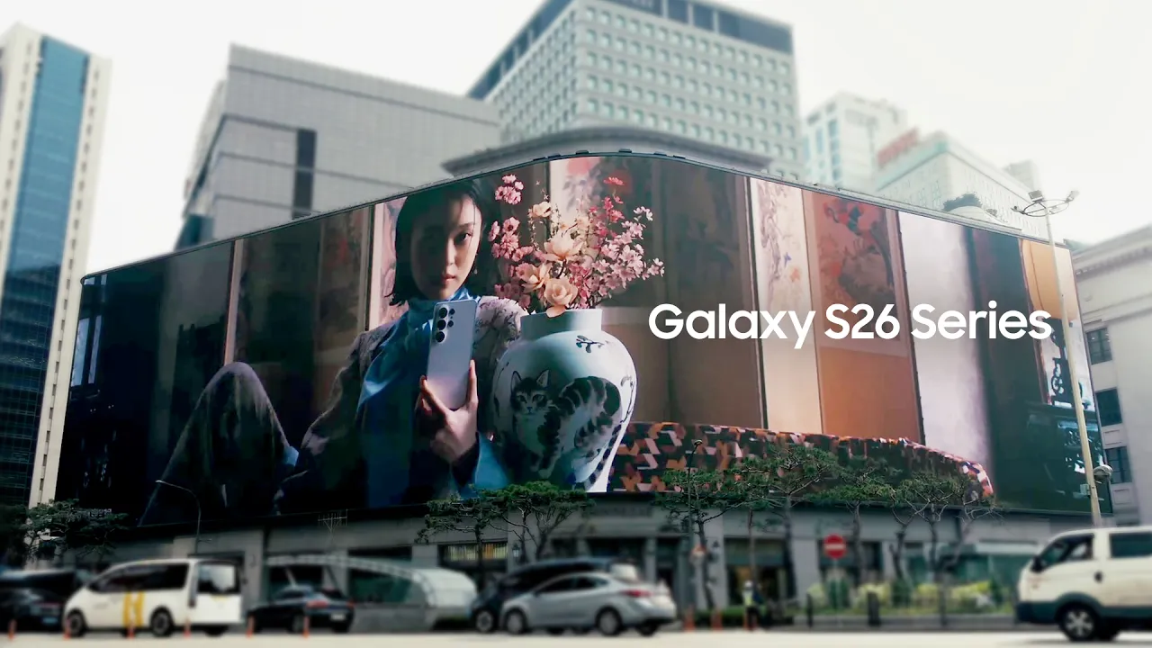
Seoul Station Ultra-Wide DOOH Film
Seoul Station On-Site Display
Official Campaign Documentation
Overview
삼성 갤럭시 S26 시리즈를 위해 제작한 〈찬란하게 열리는 한국의 힘〉은 백자와 자개함, 사자탈이라는 세 가지 한국 문화유산에서 출발한 DOOH 캠페인입니다. 각 편은 하나의 문화유산을 중심으로 각기 다른 시각적 콘셉트를 전개하며, 세 편은 하나의 흐름으로 연결해 서울역 초대형 울트라와이드 DOOH 영상으로도 제작되었습니다.
Created for the Samsung Galaxy S26 Series, The Power of Korea, Unfolded is a DOOH campaign inspired by three elements of Korean heritage: white porcelain, a mother-of-pearl inlaid chest, and the Korean lion mask. Each film develops a distinct visual concept around one of these elements, while all three were also connected into a continuous ultra-wide DOOH film for Seoul Station.
Work
Animation
Lighting
Texturing
Compositing
Year
2024
Client
Samsung
2026 © Seungpyo Han All Rights Reserved
Credits
Client
Production
Toolkit
My Role
Contribution
Samsung
Rabbit Walks
Cinema 4D, Octane, After Effects
Modeling, Animation, Lighting, Texturing
1 Shot / 120 frames